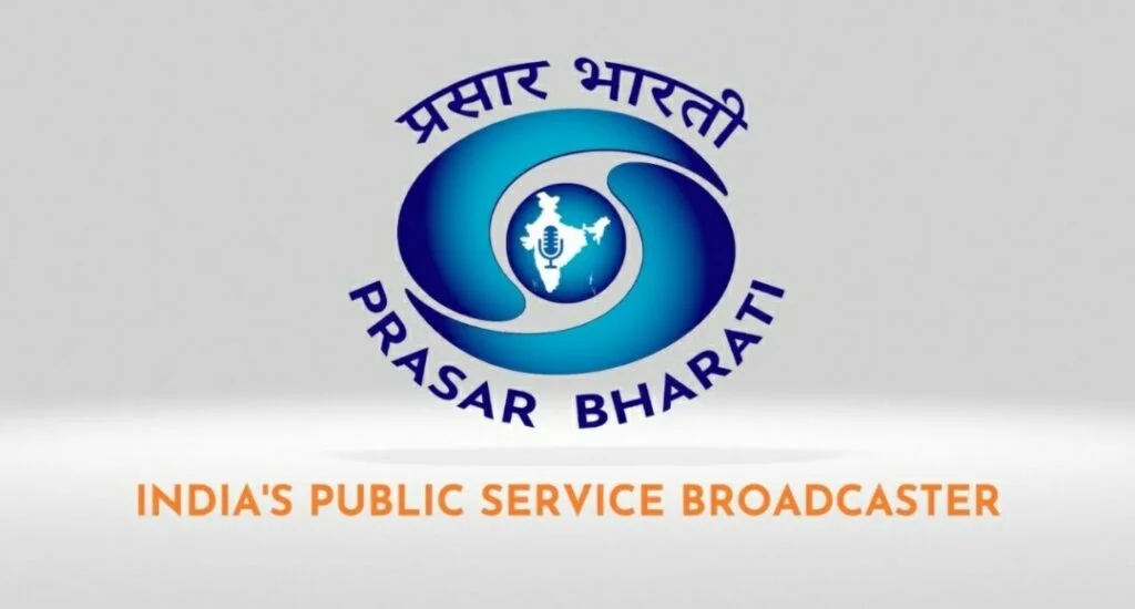
India’s public broadcaster Prasar Bharati on Monday (11 July) introduced a new logo that combines the existing logos of its two main divisions, Doordarshan and All India Radio. The iconic DD emblem forms an essential part of the updated logo, within which the map of India and microphone from the AIR logo have been placed. The organisation’s name is written above the logo in Devanagari and below it in English. The existing logos of Doordarshan and AIR will remain unchanged for the foreseeable future.
The main features of the new logo have been described as follows by the pubcaster:
While the elements in the central circle and map of India signify the service of trust, security and perfection to the nation, its colour, ‘Dark Moderate Blue’ represents both the sky and the sea and is associated with open spaces, freedom, intuition, imagination, inspiration, and sensitivity. Blue also represents meanings of depth, trust, loyalty, sincerity, wisdom, confidence, stability, faith, and intelligence. The colour blue also pays tribute to the Indian ethos and traditions associated with religious figures; mythological characters found in the Indian miniature paintings.
The updated logo was revealed by Information & Broadcasting Secretary Apurva Chandra, in the presence of Prasar Bharati CEO Mayank Kumar Agrawal, Prasar Bharati Member (Finance) DPS Negi and several senior officers of the MIB and Prasar Bharati.
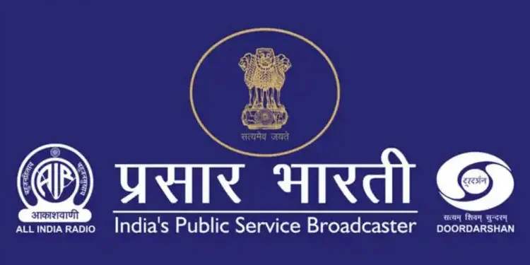
According to Prasar Bharati member (personnel) DPS Negi, the previous logo used both the AIR and Doordarshan logos on either side of its name along with the Indian emblem in the middle. Inspired by the identities of both AIR and Doordarshan, the new logo is ‘defined as a blend of both that not only incorporates elements from their visual identities but also leverages their colour combinations, to make up the identity of Prasar Bharati as a public service broadcaster’.


Logo-changing attempts have not yet borne any fruit for Doordarshan, despite minor changes
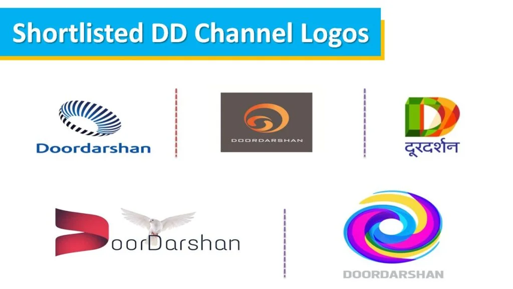
It is clear that this is only a moderate logo evolution from Prasar Bharati, as it retains several similarities with the previous ones, and does not go for any radical transformations, which befits the nature and stature of the country’s public service broadcaster. Yet Doordarshan, India’s state television broadcaster, has in the past held a public contest inviting people’s contributions for an updated and renewed logo, in order to attempt to change its perception as a staid and old-fashioned broadcaster. Some of the submissions have been very radical and would have been a drastic departure from the current visual guidelines followed by DD. But it has not followed through on changing its logo in all the years that have elapsed since this was first announced in 2017.
The closest DD has come to changing its logo was placing the existing DD emblem in a circular shape for selected channels such as DD India and DD Retro. Furthermore, several regional channels, particularly the five main South Indian channels — DD Podhigai (Tamil), DD Yadagiri and Saptagiri (Telugu), DD Chandana (Kannada) and DD Malayalam — introduced this new logo style in November 2021, while also moving the on-screen logo bug to the bottom right corner of the screen. The above channel names are now displayed only in the regional language; in English, it is instead the name of the corresponding state that is displayed, such as Kerala or Telangana. Later, DD Madhya Pradesh, DD Goa, DD Chhattisgarh and DD Girnar (Gujarati) followed suit, but the other DD regional channels are yet to implement this change.

These minor changes aside, DD has not done much to modify the general shape and design of its emblem, which has been used for decades. And yet the logos that were shortlisted as a result of the public competition were about as drastic a departure from the current DD logo as can be. They were a good showcase of creativity, but implementing them in the DD system across multiple kendras in various languages and states would have proved to be a massive challenge, which may have resulted in the expenditure of taxpayers’ hard-earned money that is better used elsewhere.

From the above, it is evident that Doordarshan has most likely decided against spending resources to embark on a large-scale rebranding campaign, similar to what Zee Entertainment Enterprises has done in the past, most recently in 2017. It may appear that DD in its current avatar may appear to be out of sync with the times in this age of OTT platforms and anytime, anywhere streaming that threatens to render traditional TV obsolete. Commercial broadcasters invest significant resources in updating the on-air graphics and appearances of their TV channels, and more changes may be in store with the upcoming merger of Sony and Zee.
However, one must not forget the public-service obligations that both DD and AIR under Prasar Bharati are required to undertake, including providing essential TV and radio services to remote and rural territories and communities that have so far not been significantly affected by the digital content consumption era. Also, Prasar Bharati’s image as the national broadcaster and an institution of state authority holds the greatest precedence over visual identity changes, so it is just as well that Prasar Bharati’s logo update is safe, if staid, option. Attempting a BBC-style rebrand — similar to the changes the British state broadcaster has been making to its logo and elsewhere for several months now — may not have gone down well with the public, and so it is best that Prasar Bharati play it safe, which is exactly the route it has taken for now.
Views expressed are personal.


7 replies
Loading new replies...
Join the full discussion at the DreamDTH Forums →