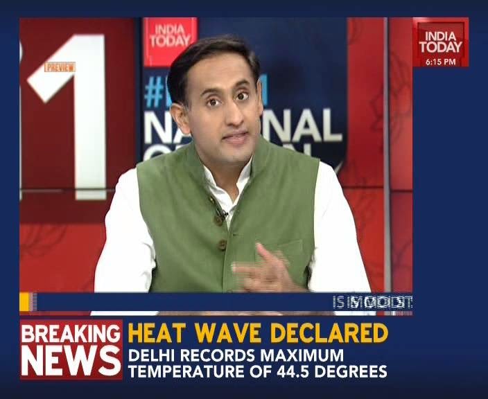
I have never taken Aaj Tak’s graphics package seriously. ABP always made an active attempt to be a little conscious of its presentation, and after the rebrand last month that good perception has increased even more. But Aaj Tak and India Today look very blasé and tired.
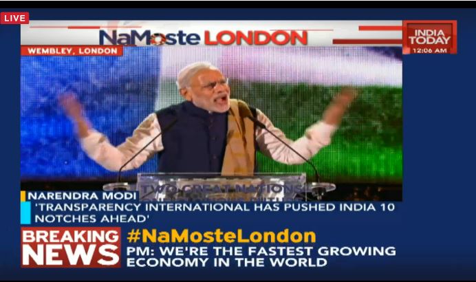
Also, since 2018, India Today uses the same fonts and in-your-face spinning, screaming graphics as Times Now, which looks atrocious; however, when it rebranded from Headlines Today in 2015, it had a much more clean and aesthetic look, as below.
Sure, ad-blocking software does a great job at blocking ads, but it also blocks useful features of our website. For the best site experience please disable your AdBlocker.