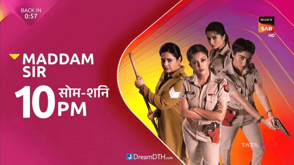
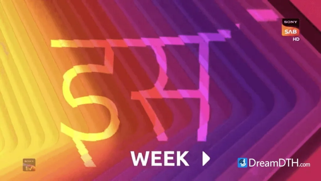
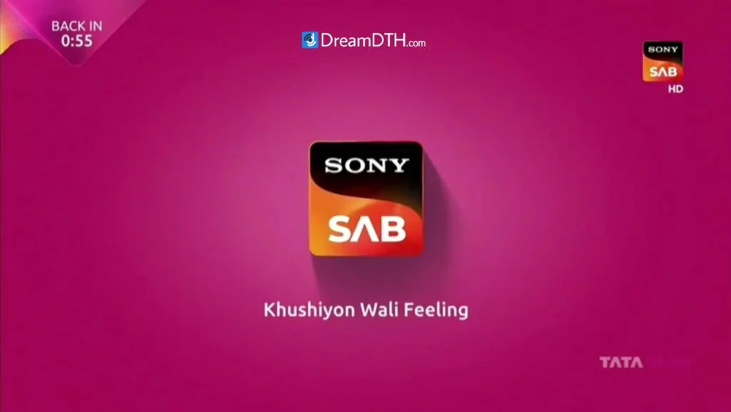
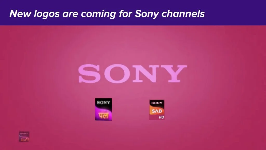
In a massive development, Sony Pictures Networks has started to test new logos and graphics on some of its channels during late-night hours. These new logos are based on that of the international versions of Sony Channel, introduced in 2019. In India, this type of logo was introduced by the streaming service SonyLIV during its rebrand in May 2020, but so far has not been used by any other property of Sony Pictures Networks India — until now.
The new logos and graphics were first spotted on Sony Pal during the late-night hours of Saturday (15 October), and then on Sony Sab on Sunday (16 October). All this comes as the broadcaster has received approval to merge with Zee Entertainment Enterprises from the Competition Commission of India as well as stakeholders. Interestingly, it also marks five years since Zee underwent a mega-rebrand in October 2017 — the month of its 25th anniversary — and the signs are clearly pointing to a similar mega-rebrand for all Sony channels in the coming weeks.
Below are some pictures of the new graphics and logos as captured by DreamDTH members.
Sony Pal:
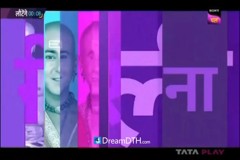
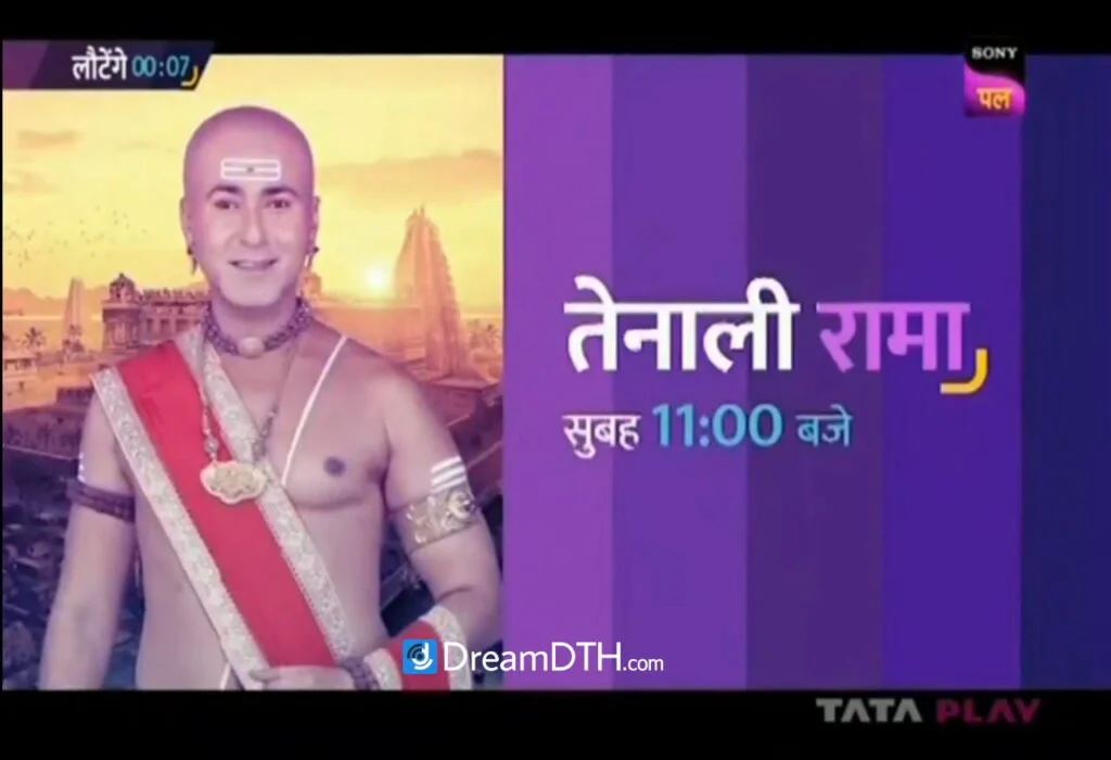
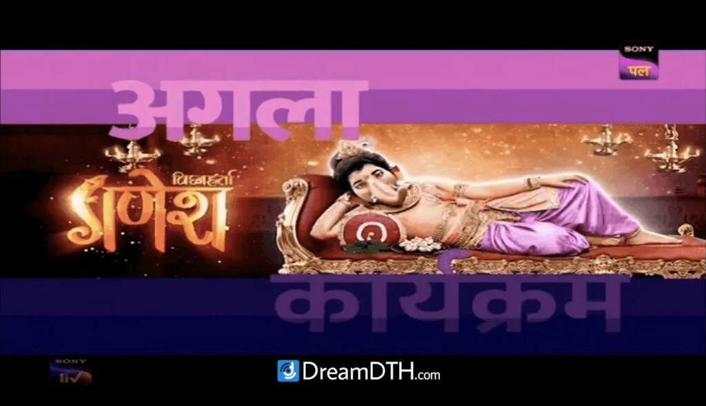
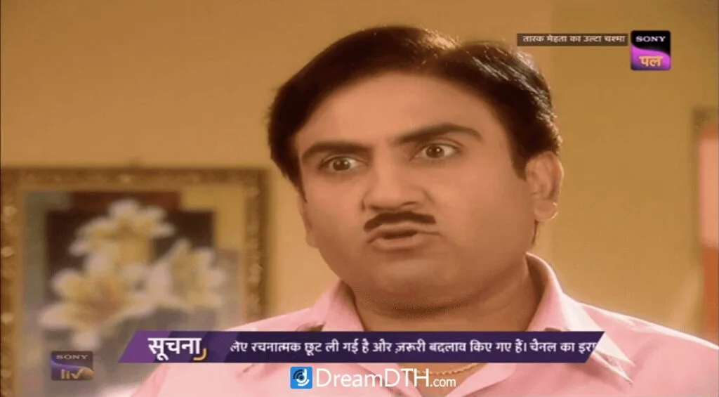
Sony Sab:
Note on graphics and typography:
The graphics packages are based on free Google Fonts such as Mukta (Sony Pal) and Ubuntu (Sony Sab), and indeed some popular Google Fonts are already used by some Sony channels in their graphics, including Mukta (Sony Marathi), Montserrat (Sony Max) and Nunito (Sony Sab). But other Sony channels use commercial, paid fonts in their graphics, such as ITC Bookman (Sony TV) and BigCity Grotesque (Sony Max 2).
Of note is the fact that Sony Pal has never rebranded since it was launched in 2014, whereas Sony Sab has undergone multiple brand refreshes in its history, from its launch in 2000 by Sri Adhikari Brothers, through its 2005 acquisition by Sony Entertainment Television India, and the launch of its HD feed in 2016, to the much more recent brand campaigns called ‘Haste Raho India’ (2017–2019) and ‘Khushiyon Wali Feeling’ (2019–present).
Over the past five years, Sony Sab has slightly tweaked and changed its graphics every few months, far more often than almost all other Indian TV channels — with the exception of Colors Kannada, which is known to change its graphics every year. The upcoming rebrand will see Sony Sab remove the ‘laughing’ letter A as well as the H:) (HD) wordmark, which was introduced during the June 2017 rebrand, from its logo.
These are subject to further changes and decisions taken by SPN, and it may be longer before the Sony channels officially rebrand. Nevertheless, the new corporate image of the Sony channels sets an exciting precedent for Culver Max Entertainment (the new official name of Sony Pictures Networks India that was announced in April) and its grand merger with Zee that should take place in the near future.






310 replies
Loading new replies...
Join the full discussion at the DreamDTH Forums →