JollyLNB
News Columnist
- Joined
- 5 Oct 2014
- Messages
- 7,880
- Reaction score
- 17,543
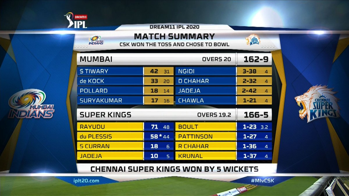
I think this scorecard has a much better font than the one used for the IPL. For the past 6 to 7 years the IPL has used an extremely blocky, squarish font which I think is not conducive to readability. The rounded font of the WPL is much better. Also, good that Viacom18 is using Kannada graphics on CKC, though I wish there were more Sports18 channels so that both English and Hindi could have an HD broadcast.
IPL scorecard for comparison:

IPL scorecard for comparison:


