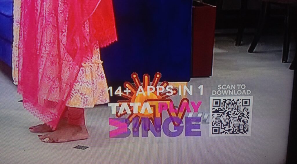
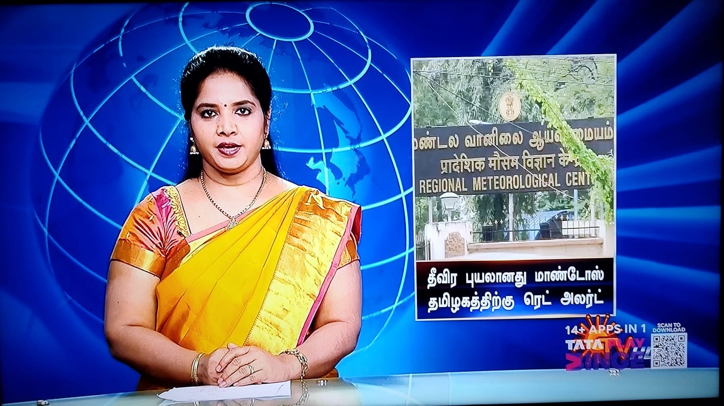
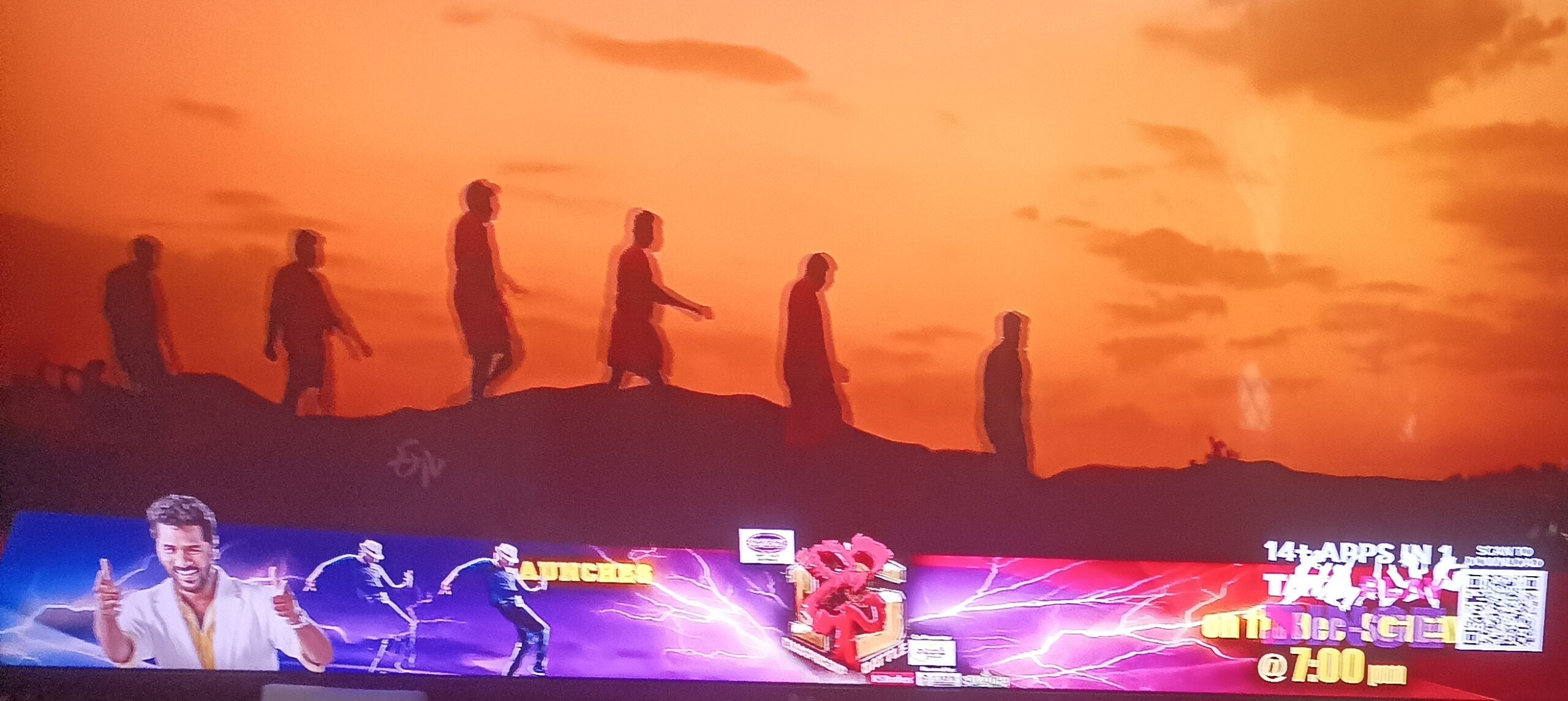
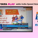
Once known for its premium service and customer oriented features, Tata Play (previously Tata Sky) has added a huge Tata Play Binge logo with a QR code on all its HD channels in a bid to promote its OTT aggregation service.
The move comes at a time when other DTH operators are trying to improve the television viewing experience of their customers and minimize distractions on screen by making their logos transparent and smaller.
Airtel Digital TV for instance, recently made their Live TV watermark transparent and they also move their logo position so that it does not overlap channel logo or other important content like scoreboards on sports channels.
The new logo of Tata Play Binge is not only large but also completely opaque, it hinders the content on screen and looks cheap. In contrast, the Free to Air (FTA) service provider DD Free Dish had a similar logo with QR code, but a similar step was not expected at all from a paid service provider.
The addition of that new logo has been overwhelmingly opposed by all Tata play customers but so far the company has not responded to their demand. This large logo is visible on all set-top boxes and live TV on Tata Play mobile app and web also.
“If the Tata Play management thinks that seeing this logo on TV will influence the mind of a potential buyer, they are absolutely right. It will influence their mind – to not buying this connection. This logo is ridiculous,” said Subha, a well known member of DreamDTH Community Forums.
Scanning the QR code on screen takes users to the Tata Play Binge app on the App Store. This is a very aggressive and non-consumer friendly method to promote something. The company was already pushing its OTT aggregation service through its app, website, promotions on home channel, banners in EPG, etc. There was no need for a consistent huge advert on the screen.
Paying customers expect a better experience and such a move from Tata Play was unexpected. Promotions are fine as long as they do not ruin customer experience, Tata play can surely improve its Binge app awareness by this method but people will not necessarily subscribe to it due to such poor, intrusive marketing strategy and the company will lose its years old reputation as a brand that considers customers supreme.




141 replies
Loading new replies...
Join the full discussion at the DreamDTH Forums →