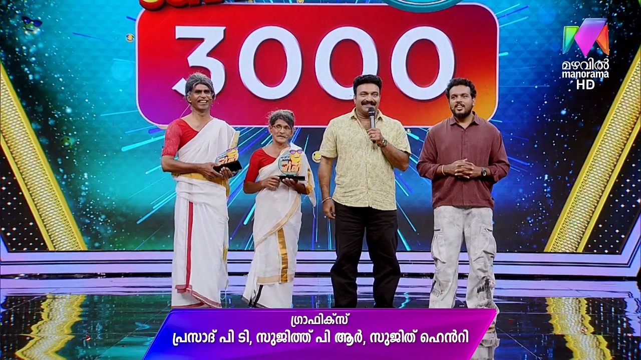
Few changes I observed:
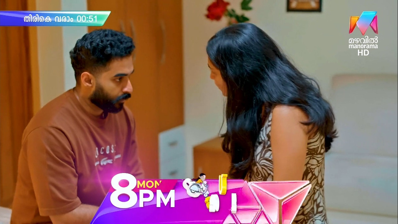
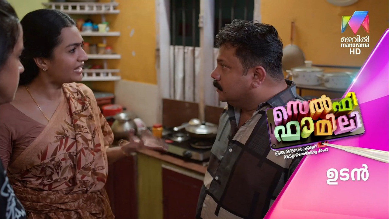
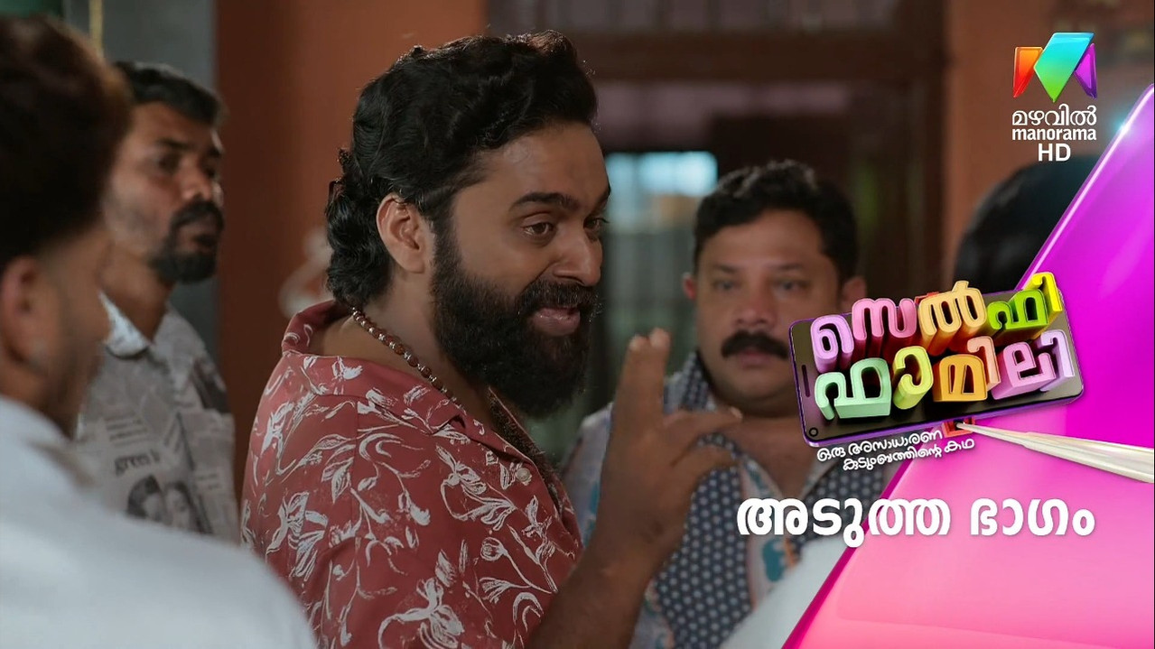
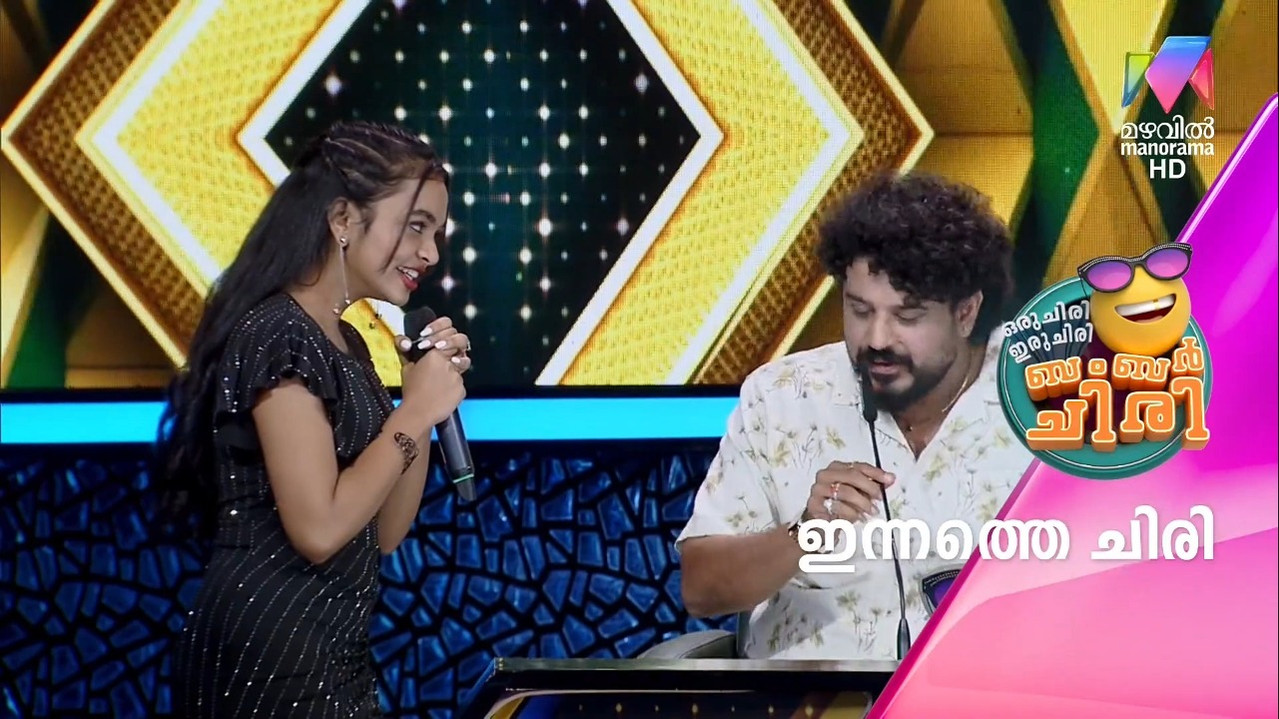
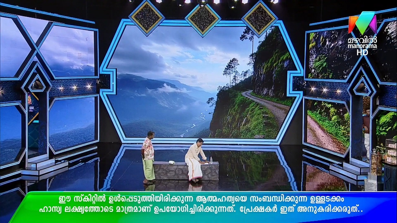
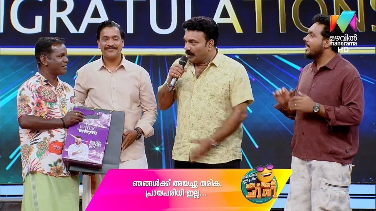
1. Logo size is increased too much and it's very distracting especially on SD version.
2. Logo position moved more towards corner, earlier there was sufficient gap with small logo.
3. I feel that more colors are added to the logo color changing effect.
4. MMTV copyright logo at end of shows has been updated I think after manyyy years with morden font.
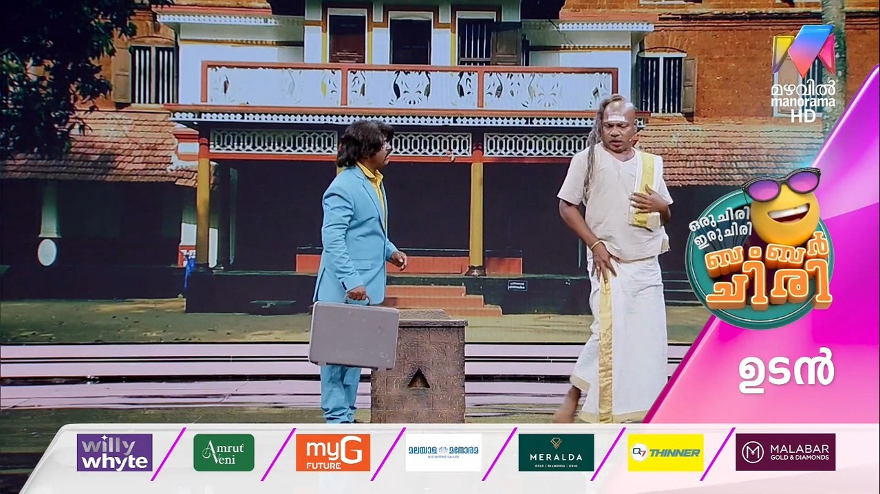
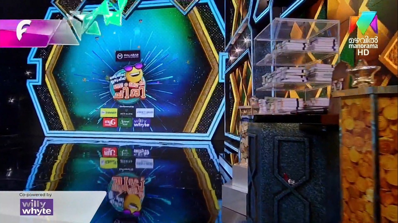
5. As I mentioned before, sponsor tag is enlarged like other GECs.
I hope soon manoramamax gets a revamp. Manorama news got revamped now mazhavil. Next manoramamax followed by manoramaonline(since MMTV logo got a fresh new look)