JollyLNB
News Columnist
- Joined
- 5 Oct 2014
- Messages
- 7,961
- Reaction score
- 17,944
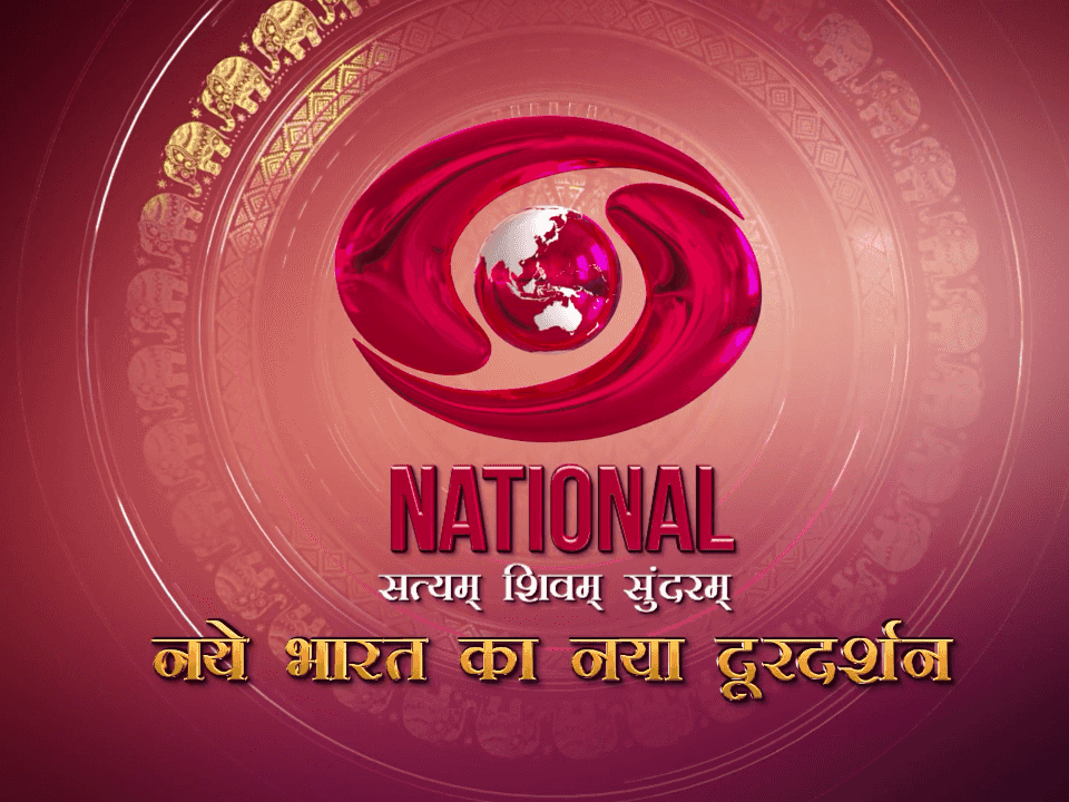
Perhaps DD did some internal consultation on the appearance on the logo. They might even have read my article and taken feedback from it.  I had mentioned how the logo and Satyam Shivam Sundaram text was not so legible, which they have corrected.
 dreamdth.com
I had mentioned how the logo and Satyam Shivam Sundaram text was not so legible, which they have corrected.
DD National to undergo rebranding on Independence Day with new shows
While the new logo and shows are in the hope that more people take note of Doordarshan, in practice they are not too likely to help with DD becoming relevant in the OTT era.


