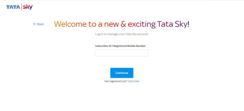
Tata Sky, India’s leading Direct to Home (DTH) operator by subscriber base, has redesigned the user interface of the MyTataSky web portal. The new UI looks more clean, modern, and it also resembles the theme of the Tata Sky website with gradient texts.
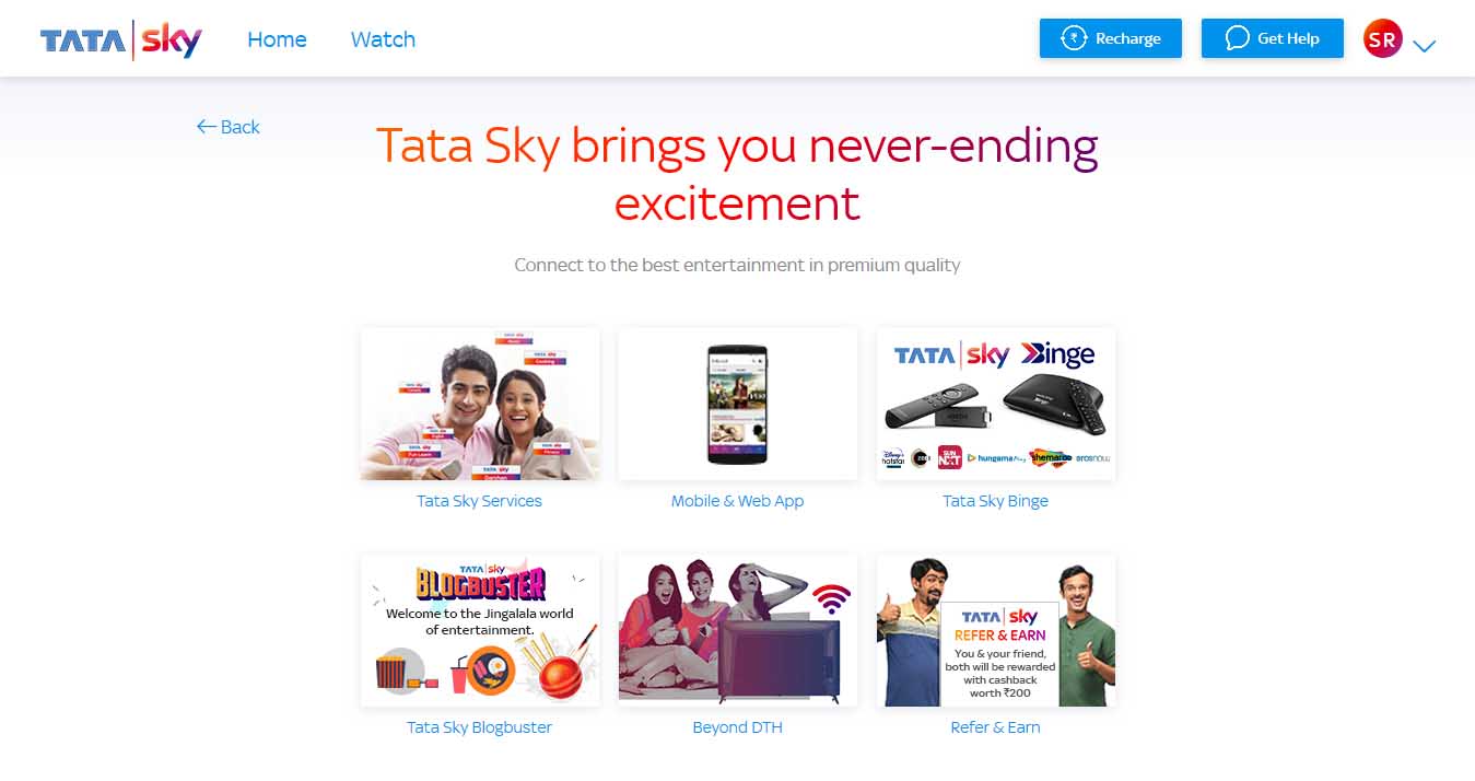
Tata Sky also has a new URL for the redesigned portal. Users who put mytatasky.com on the address bar of any modern browser are being automatically redirected to the new website. However, the old TataSky portal is still available and accessible through old URL.
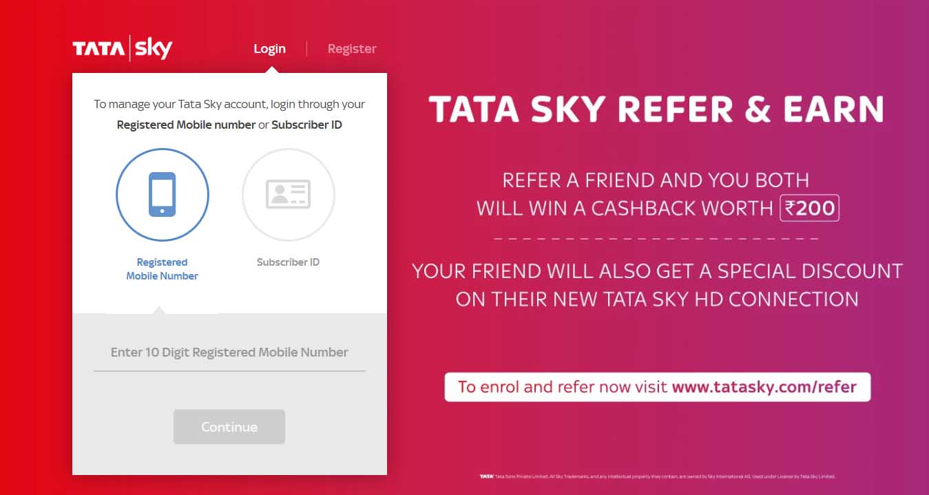
The new Tata Sky portal login web page comes with a white background, and it does not show any Tata Sky offers. Users can either enter Registered Mobile Number or Subscriber ID in the same text box.

In contrast, the old Tata Sky portal login web page has a color background with Tata Sky ‘Refer and Earn’ offer, and users are required to select either Registered Mobile Number (RMN) or Subscriber ID before entering the credential into the text field.
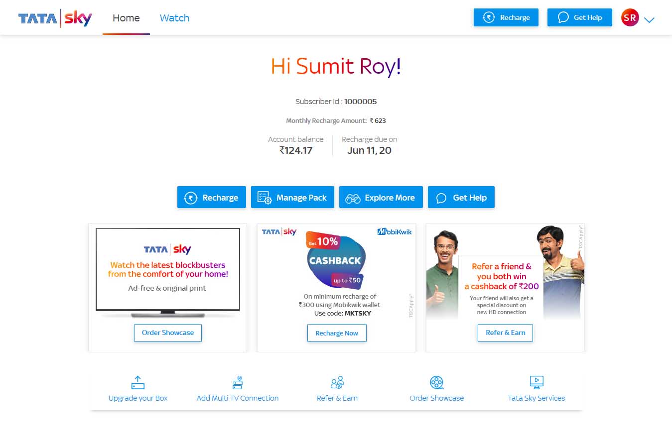
The new Tata Sky portal home page shows the subscriber name with big gradient text, followed by subscriber ID, monthly recharge amount, account balance and due date on the top middle of the web page. The home page also has a recharge, manage packs, explore more, and get help button with a light blue box that follows the Tata Sky theme. Below that, it shows cards with various Tata Sky offers. On the top left, it has a drop-down menu with various useful links, including change passwords, personal & contact details, transaction history, logout, and more.
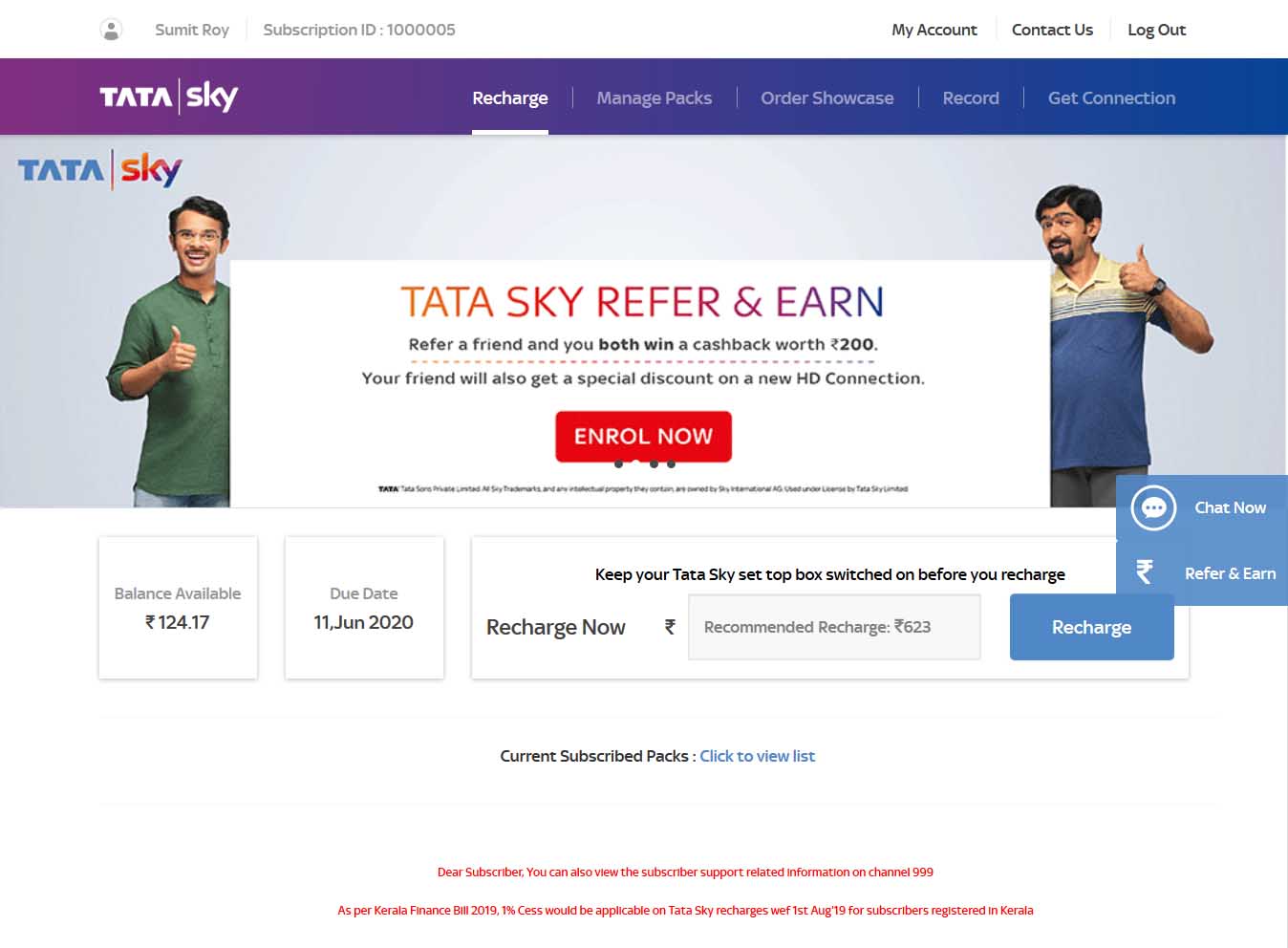
In contrast, the old Tata Sky portal home page shows subscriber name and ID on the top right, and my account, contact us, and logout links on the top left. Below that, it has links to recharge, manage packs, order showcase, and get connection. The home page of the old Tata Sky portal also shows various Tata Sky offers on the carousel gallery.
Tata Sky has redesigned almost every element of the Tata Sky portal, including recharge and help section, transaction history page, order showcase page, and contact details page. However, the chat UI is still the same as the old Tata Sky portal. For now, both new and old Tata Sky portals are accessible simultaneously.

