Stvnn
Contributor
- Joined
- 6 Apr 2021
- Messages
- 1,354
- Solutions
- 1
- Reaction score
- 1,789
Special Logo for Krishna Astami
![]()
![]()
![]()
Btw off topic: Star maa music showing bigg boss
Does it do this always
![Face with rolling eyes :rolling_eyes: 🙄](https://cdn.jsdelivr.net/joypixels/assets/8.0/png/unicode/64/1f644.png)
Special Logo for Krishna Astami
![]()
![]()
![]()
Today activated this channels bro. So i don't know about it brotherBtw off topic: Star maa music showing bigg boss
Does it do this always![]()
Yes, season 4 highlights everyday 6pm. This week is finale week.Btw off topic: Star maa music showing bigg boss
Does it do this always![]()
Not... Etv channelsApart from ETV bal bharat did any other channel showed logo or mentioning about krishna janmashtami today . etv channels not subcribed only etv bal bharat dont know about other etv channels , in zee picchar saw 1 krishna related old black and white devotional movie airing , other channel didn't aired any devotional movies it was sad or confusing even when on special day channel not airing even old devotional movie related to gods.
Unfortunately, this is an inflection in my opinion and it would be appropriate to change something in time, because it is even bizarre that most or all Polsat channels have the same graphic design, fonts, sounds between transitions and that they differ only in color and no other shape. In those projects that were once shown, there were slightly different configurations. So it does not differ in any way, in this respect it is a disappointment.Anyway, it is something that I wrote earlier, that they should differ in something, similar to the logos. Minimalism to exaggeration and although I like some changes, they went a step too far.![]()
An example of Polsat’s new graphics package is below.I agree with the previous speakers.
The idea for a fantastic rebrand, a gradual revealing of it all in the form of campaigns / spots too ... but Polsat, like Polsat, had to kick it all off somehow.
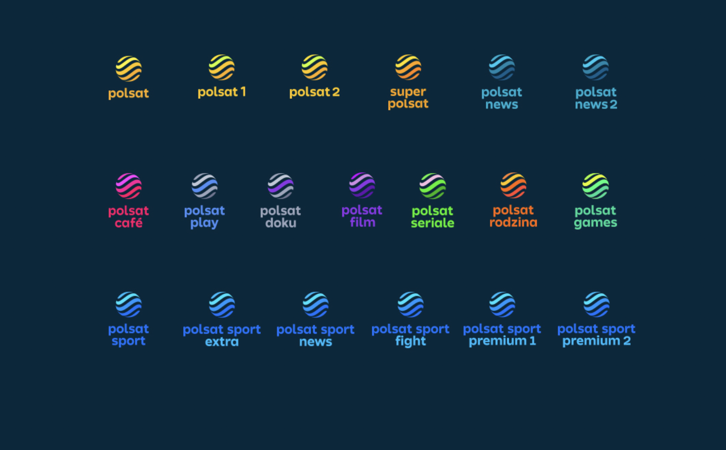
Let me start with the logo. Initially, I thought that Polsat's logo was not sunshine at all and I liked it on average. But ... somehow it had to be refreshed, it's high time after so many years, and I understood that the sun simply gives a completely new shape. Although for some it is sunshine, for others a ball, for others the stick knows what, it is even fine. Compared to the thematic channels logo. It is true that in the form of various patterns, it would be a bit difficult to present themselves on the screen as reduced, but then they came up with an idea that would somehow make it all easier. And now there are the same waves everywhere, only colored in different shades. ... The on-screen logos aren't bad, but they're not good either. They are transparent, that's a fact, but they are a bit too big (I would have made it smaller), and what's more, they are terribly too dark, and in addition the contour is terrible ... you can see that they did it quickly. ... And since Polsat introduced all these changes haphazardly, the same happened in Polsat News. The screen graphics with the new logo, but still almost the same as before, they just painted it in different colors, so there was not even a change there, only a modification there.
Same for Star Pravah & other Star channels![]()
According to programs now on Star Plus this tagline suits nicely![]()
We get it, advertisements are annoying!
Sure, ad-blocking software does a great job at blocking ads, but it also blocks useful features of our website. For the best site experience please disable your AdBlocker.