DTH operator Tata Sky on Monday revamped its home screen of its set top boxes to provide information in a clean, modern, refreshing, and easy to understand way. Apart from the design changes, the DPO has also added new features for more convenience to its customers.
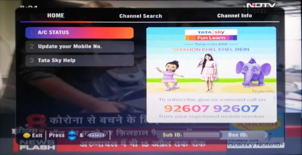
The home page which earlier used to provide only service messages, balance, and due date is now completely overhauled and bears translucent background to minimize disturbance in the TV viewing experience. The new dark background matches perfectly with the rest of the UI elements like EPG, Settings, etc.
The full-page promotional banner’s size is also reduced and now takes less than half of the screen which will further reduce hindrance and make the reading of useful information like account details easy.
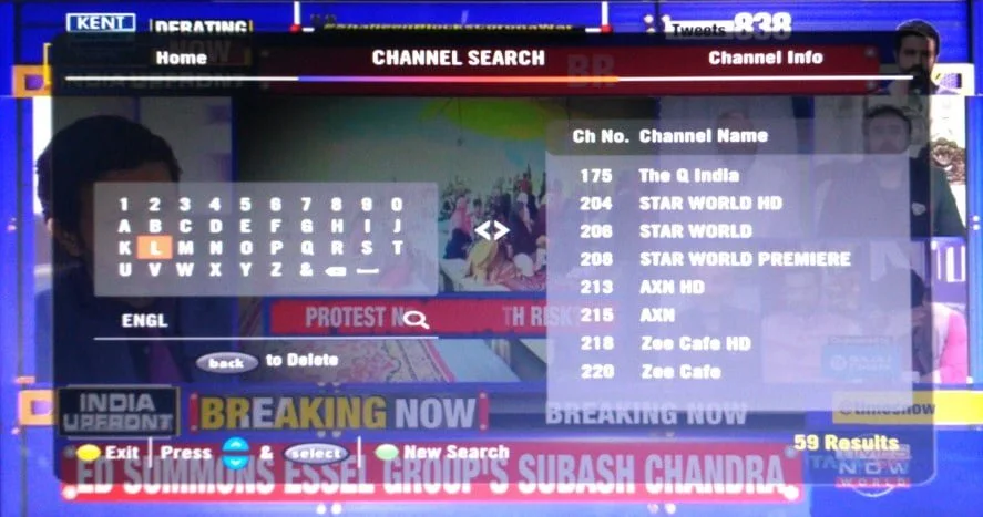
The home screen now boasts of two new menus for searching channels and accessing information about channels. There are more than 600 channels on Tata Sky and it’s pretty difficult to find any channel especially for new users, the DPO has tried to resolve this problem by adding the ‘Channel Search’ feature which allows you to type the name, number or language and easily find what you are looking for.
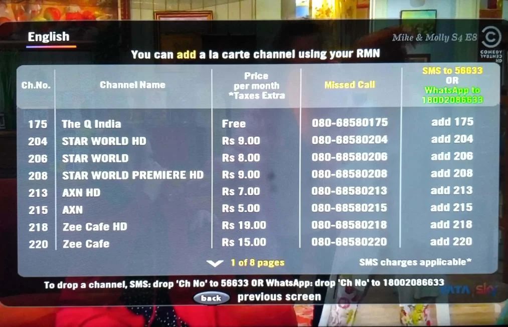
Another new feature ‘Channel Info’ is added which gives genre-wise information about price, missed call numbers and SMS/WhatsApp codes to activate any channel on an a-la-carté basis. A tab to update registered mobile number is added as well which is a guide on how to change your RMN.


Changes are nice and if they change the other options like channel selection and channel information and complete user interface then it will be good. I liked D2h and dish tv’s UI very much
Yes it’s a fantastic move by Tatasky 👍.