No bro.. I think the logo should be full screen and the serial should be small, transparent and placed at the bottom left. So that we can enjoy the logo & the saas-bahu doesn't distract us.
No bro.. I think the logo should be full screen and the serial should be small, transparent and placed at the bottom left. So that we can enjoy the logo & the saas-bahu doesn't distract us.
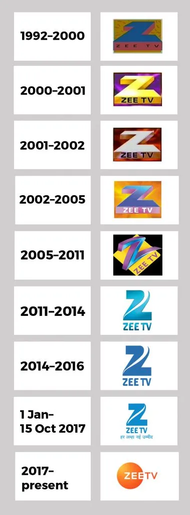
They should come back their old logo with reduce in size plus transparent colour
‘Z’ is their identity so comeback it ..current one ZEE in round doesn’t make any sense
They should come back their old logo with reduce in size plus transparent colour
‘Z’ is their identity so comeback it ..current one ZEE in round doesn’t make any sense